A while ago, a great client, a branding team of a global biotech, approached us with a special request. They wanted their brand illustrations to reflect the diverse world of people they serve with their science.
We said yes straight away since these types of design challenges rarely arise.
Healthcare brands, despite representing the most human industry, are often not at the forefront of Diversity, Equity and Inclusion (DE&I). You look at pharma comms and see senior models photographed as patients. To hell with inclusion, right? And what about diversity? A stock image titled “Multiracial medical team having a meeting discussing a patient’s records” will do the job.

Still, doing wrong is not intentional. Most brands haven’t reached a stage in development where they start giving their brands a human face.
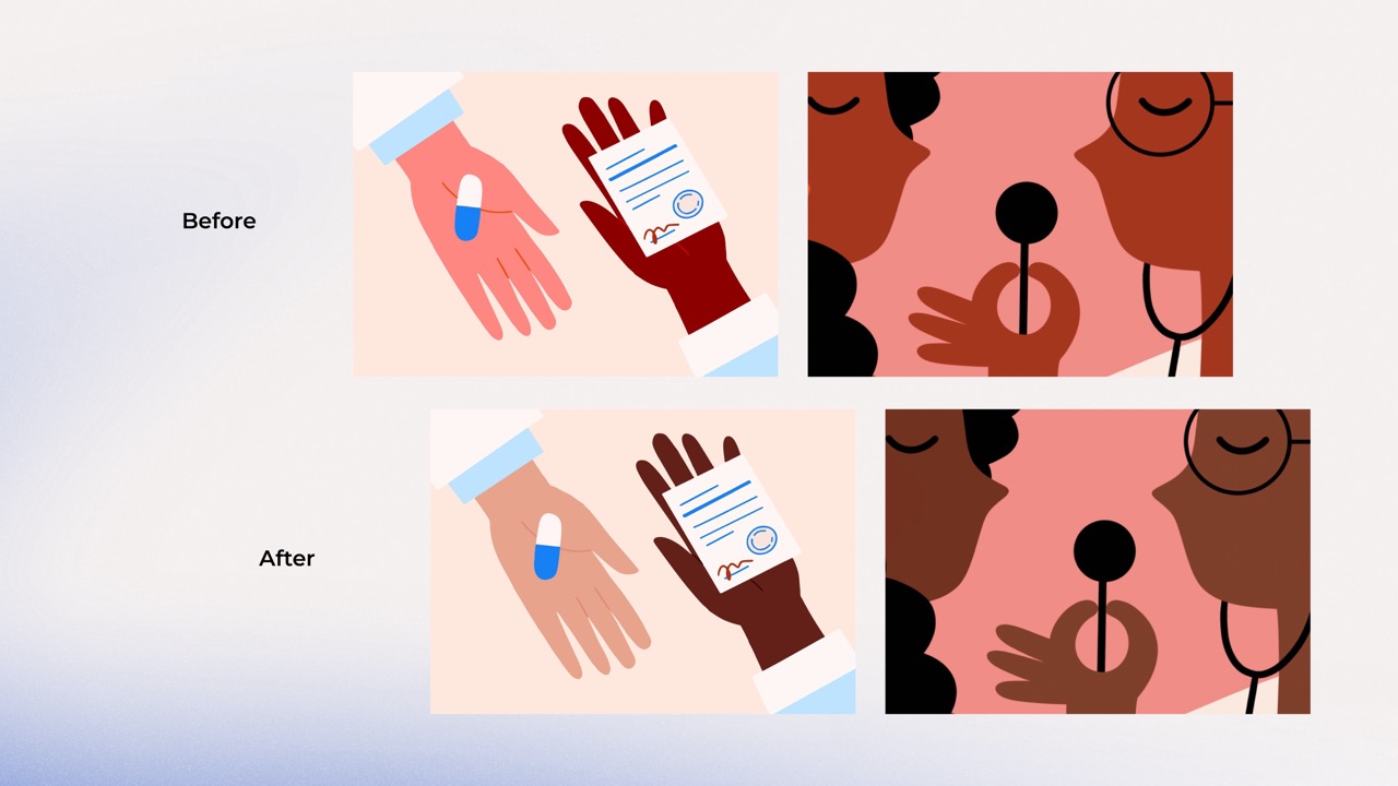
But this client is different from its competitors. Building an empathetic brand image isn’t just a buzzword for them but the spine of a long-term strategy. Nothing proves this better than the illustrations they commissioned from contemporary artists to tell their complex stories about diseases, vulnerable people, or health inequality.

Journey to The Ultimate Palette
We started the experiment by turning to the most recognised colour experts and delved deep into Pantone’s Skin Tone palette. Unfortunately, this path soon turned out to be a dead end. Applying the guide’s colours made our illustrations lifeless.
The Pantone Skin Tone guide might be helpful for prosthetic designers developing healthcare products matching their patients’ skin or for stylists to colour-coordinate their palettes for the season. But it didn’t work for us. So we kept looking.
Our client had this incredible collection of photos of their diverse team. Why not use this library as a starting point?
Why spend time and budget if the solution might be right under our noses?
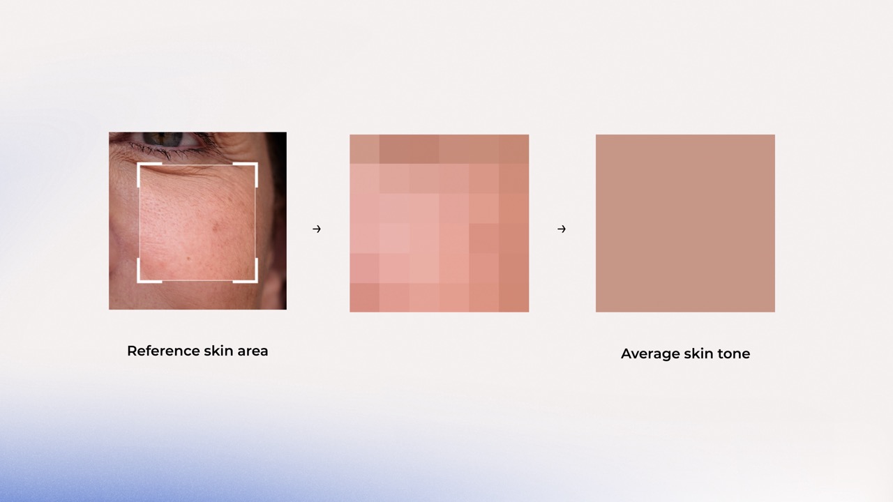
First, we investigated their collection of employee photography. Then, we built a list representing all ethnic groups working for our client. Created a technique to average out the skin surface and establish a base colour. Then, we ran a test.
The initial result?
Still somewhat lifeless images, in disharmony with the look and feel of the illustrations and the brand.
We couldn’t figure out the cause. First, we suspected that it was due to artificial studio lighting. But when we raised this with our client, it turned out that they used natural daylight in their shoots. This wasn’t another dead end, though; looking for an answer led us to the next phase of our experiment.
Understanding the complex nature of human skin
It is known that melanin affects skin colour, but what about the dozens of other factors that play a pivotal role? Various haemoglobins give reddish or bluish colour to people with lighter skin. Sun exposure isn’t the only melanin booster, hormonal factors can do that, too. Ageing plays a crucial role as well. As our skin gets thinner with time, its colour changes, too.
The colours we see come from how things handle light, whether they soak it up, bounce it off, or let it pass through. So, the most important of all these factors is how the skin absorbs, reflects or transmits light.
The skin has three layers just to make our life more complicated. And each interacts differently with light. Melanin and keratin are important components of the epidermis, the first layer. The former absorbs and scatters both UV and visible light, the latter reflects light. Next down in our tissue sandwich is the dermis. Here, while collagen and elastin scatter the light in different directions, blood vessels can absorb it, depending on the oxygenation level. Last down is the hypodermis. This is where fat lives, giving the skin a yellowish hue.
After the twofold increase in our Latin vocabulary, we decided to look at skin colour through the lens of dermatology.
This led us to the Fitzpatrick Scale.
A system developed in 1975 to classify human skin colour based on how different types respond to UV light (Hobbs, 2022). The Fitzpatrick Scale was the de facto standard for engineers and researchers. It has also been the basis for the skin colours used in emojis (Sweeney and Whaley, 2019).
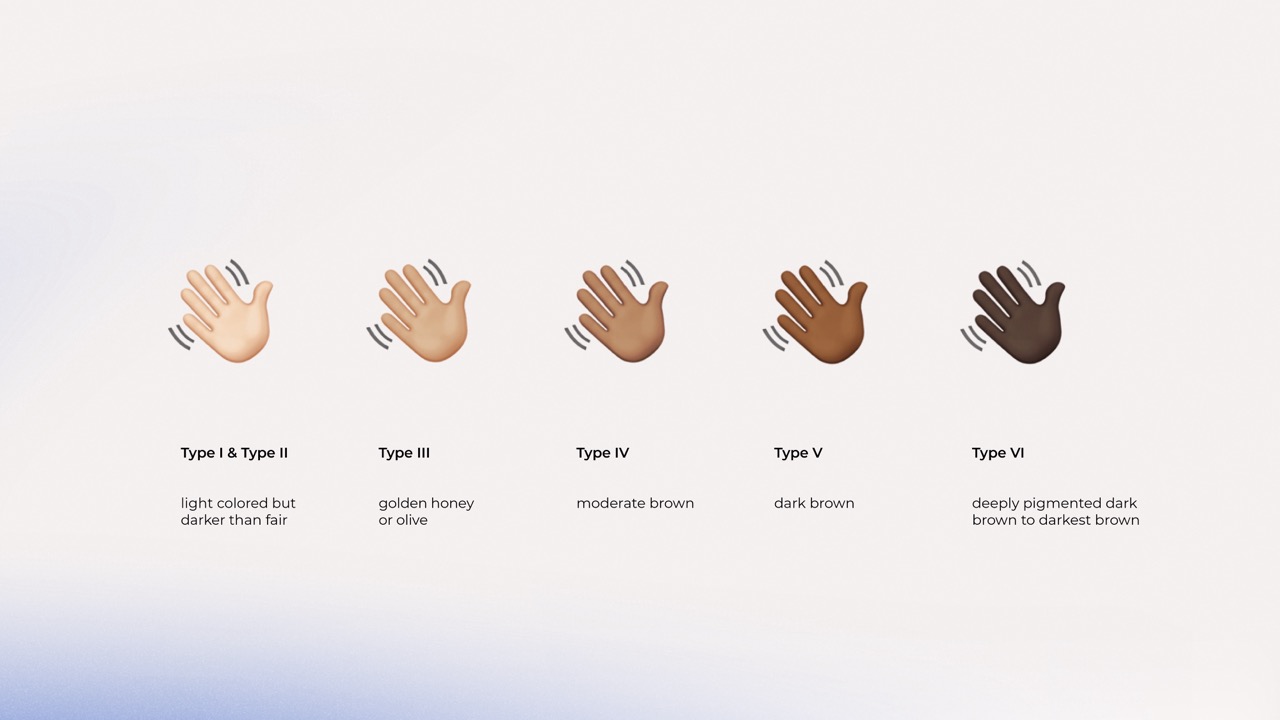
Since the Fitzpatrick scale implied that darker skin doesn’t burn, it lacks enough dark tones. Articles disputing its shortcomings could fill a book, so let’s fast-forward to our next stop.
We were almost there.
Learning about the limitations of the Fitzpatrick scale led us to the work of Ellis Monk.
Monk, an associate professor of sociology at Harvard, wanted to solve a major problem of oximeters. Melanin can block the light used in the devices to detect oxygenated blood. So, devices could fail patients with darker skin (McFarling, 2023).
Working with Google, Monk developed a scale, grounded in his decade of research into colourism.
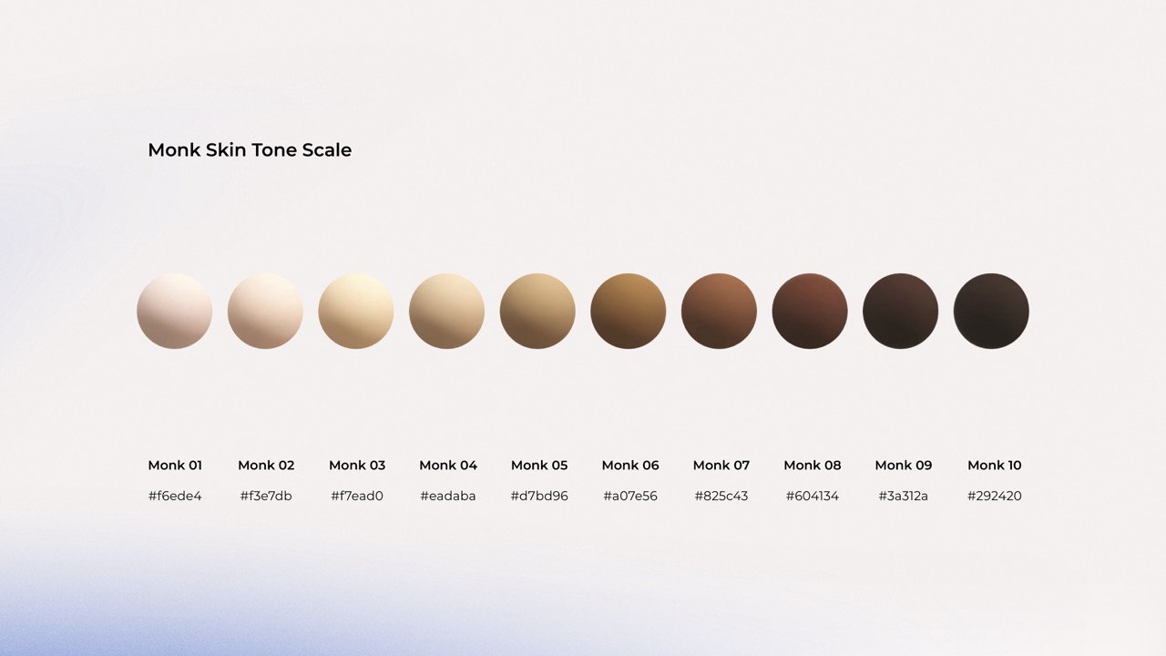
Since then, the tech giant has applied the 10-shade scale in their search engine and various machine learning applications, assuring us that it can provide a good base for our work, too.
We finally reached the last stage.
Joining the dots
Using the inputs from our different experiments and the Monk scale, we designed a palette grounded in real-life diversity that considers the unique nature of skin—this beautiful, many-layered organ, which gave us quite an exciting few weeks.
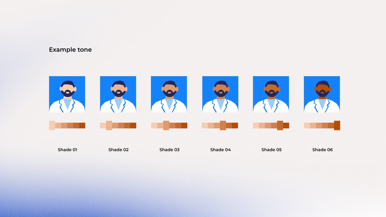
We developed sets of hues, each with multiple options, ensuring that our illustrations would resonate with people from all over the world and also the light setting of various environments.
Reflecting on this experience, it might sound like the story of hundreds of Google searches, but we’re proud of what we’ve achieved.
And, we’d love to share more with those interested. If you’re curious, drop us a line.
Let’s make design more inclusive together.
Reference list:
1. Hobbs, H. (2022, August 30). What Are the Fitzpatrick Skin Types? Healthline. Retrieved September 13, 2023, from https://www.healthline.com/health/beauty-skin-care/fitzpatrick-skin-types#About-the-Fitzpatrick-skin-types
2. Sweeney, & Whaley. (2019, June 12). Technically white: Emoji skin-tone modifiers as American technoculture. firstmonday.org. Retrieved September 13, 2023, from https://firstmonday.org/ojs/index.php/fm/article/download/10060/8048
3. McFarling, U. L. (2023, July 31). Before making unbiased pulse oximeters, researchers need a better way to measure skin tone. STAT. Retrieved September 13, 2023, from https://www.statnews.com/2022/12/05/unbiased-pulse-oximeters-researchers-need-better-way-to-measure-skin-tone/#:~:text=Monk%27s%20scale%20has%2010%20shades,represent%20medium%20and%20darker%20shade