Inclusive design needs a rethink, patients want to look at things that move (or that at least aren’t plain, boring text) and health brands need to go from sterile to human – this week I’m bringing you three design trends that will steer how healthcare looks over the next twelve months. Dig in!
1. Inclusive design, but make it actually inclusive
Designing with inclusivity in mind is not the trend here. Challenging our assumptions of what inclusive design really means is – or should be. “Without concrete steps and specific plans that centre the disability community, inclusive design is essentially design thinking rebranded with a dash of inclusivity,” Fast Company’s Aaron Chu writes in his must-read take on the massive overuse of the term “inclusive design” and the impact it has on disabled communities. He concludes, “If the goal is to break down the boundaries that exclude the disability community, then the bar needs to be set higher. Awareness and ideologies alone are not enough.”
I couldn’t possibly agree more. Designing for audiences who experience discrimination or stigma based on their physical and cognitive capabilities, age, race or gender can only make a real difference in their lives if we design with them, not just for them.
Chu cites Microsoft’s Inclusive Design Toolkit as an example which, despite claiming to “enable and draw on the full range of human diversity”, uses no more than four categories to classify disability. Although it makes an attempt to explain disabled experiences with real-life scenarios, it does so through non-disabled eyes. For example, an amputee is equated to a new parent holding a child with only one arm. “Does inclusive design insinuate that a new parent who holds her child in one arm also experiences the gaze and the looks on the street like that of an amputee?” Chu asks. I feel it shouldn’t.
No wonder more and more organisations create so-called “empathy labs”, Forrester reports, to give employees a better idea of what it’s like to use the company’s products and services for customers with, say, colour blindness. While this isn’t the worst idea in the world by any means, especially when it comes to usability testing, we can do much, much better. Like involving people who actually have colour blindness and, as a result, experience exclusion in their daily lives in the design process. In this way, they can educate us on their needs and wants, points out experience design analyst Gina Bhawalkar.
2. It’s time to build strong health brands – and human ones at that
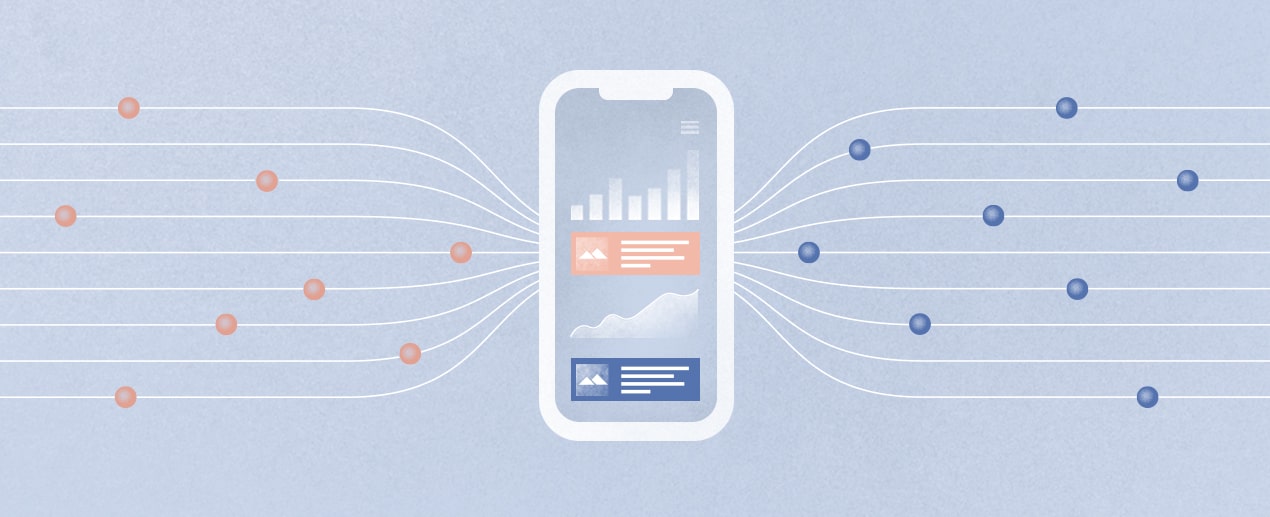
If you’ve read our previous post on the changing face of healthcare marketing, you’re no stranger to the rapid consumerization of healthcare. In case you haven’t, here’s the TL;DR: targeted by walk-in clinics, health apps, online pharmacies, virtual care providers and Dr Google every second of every day, customers are positively spoiled for choice when seeking medical advice and treatment. This spells disaster for industry players with little to no means of differentiating their products and services from those of their competitors.
The problem, according to Creative Review’s Rachael Steven, is that healthcare isn’t exactly known for its branding prowess. She explains, “From the garish designs on over-the-counter medicines, to the sea of brands with blue logos and names that riff on health and wellness, it’s an industry that is rife with cliché and designs that feel distinctly un-human.”
But the tide might just be turning. Courtesy of brand strategy agency FutureBrand, Luye Medical Group has recently launched a new global mental healthcare brand called Mindfront that takes a personal, uplifting approach to a serious and often neglected issue.”Our solution was to draw inspiration from the brand idea ‘always front of mind’ to create a dynamic new mental healthcare brand that stands out in both a local and international context,” explained FutureBrand Creative Director Sam Yang.
In another example, a Seattle-based, family-run dental practice has rebranded itself as The Smile Place. Besides sounding infinitely better than “dentist”, the new brand is all about making smiles wider and brighter while putting patients at ease with oral health in every aspect of its identity, from the logo through to interior design and social media content.
3. Show, don’t tell: the rise of infographics and animations
In another must-read piece I’ve recently come across, epidemiologist and PH Spot founder Sujani Sivanantharajah makes an excellent point. That is, there’s a lot of misinformation about health out there from unofficial sources that spreads like wildfire just because it’s visually appealing. So why not make sure public health professionals are better equipped to share accurate, reliable health information with people in a way that actually engages them? She’s referring to infographics in particular, which can be incredibly powerful in breaking down complex health information into easily digestible bits.
Data seems to back her up.
In a study published in December 2021, researchers found that infographics can in fact be a low-cost, high-impact tool for disseminating health information, with participants rating the ease of understanding 4.66 out of 5 on average. In another study, the impact of online infographics on public knowledge, sentiment and willingness to use face masks during the COVID-19 pandemic was assessed. The verdict was that infographics had led to a higher overall recall of appropriate mask wearing techniques among participants, plus willingness to use a mask ranging from 84 to 88%.
When it comes to driving engagement and awareness, animations are infographics on acid. ‘My Hero is You’ was created by the Inter-Agency Standing Committee, the highest-level humanitarian coordination forum of the United Nations, in a bid to help kids tackle the psychological burden of the pandemic. German animation studio Kurzgesagt’s videos are proof that science can look good and sound simple, even if it’s about topics as complex as the immune system or genetic engineering. Add humour to the mix, and you get the explainer of Crohn’s & Colitis Foundation of America about the realities of living with IBD.
Of course, aesthetics is not the only thing animated videos can bring to the table. Research has shown that spoken animation is the best way to communicate complex health information to low-health literacy audiences, both in terms of information recall and attitudes.